
Portfolio
Graphic Designs by MaKayla Chandler
Hello, I'm MaKayla Chandler, a passionate graphic designer. On this website, you'll find a collection of my work in my portfolio. I hope you enjoy exploring it!
Travel Magazine
This is an eight-page travel magazine where I carefully selected typefaces that complement each topic. I also color-matched from the images to ensure balance and harmony throughout the design. With an image-driven approach, I aimed to captivate the viewer's attention. All images are stock photos, and the layout was created using Adobe InDesign. For the advertisements, I utilized Adobe Illustrator, while the cover and back pages were designed in Adobe Photoshop.
Page 2
Page 3
Page 4
Cover
Page 5
Page 1
Page 6
Back
Frida Kahlo Exhibition Poster
This is a personal project I created – a poster for a Frida Kahlo exhibition. I focused on using bold typefaces to grab the attention of passersby and draw them in. The entire design was crafted in Adobe Illustrator.
Travel Poster
This travel poster for New York features a monochromatic color scheme, chosen to create a sense of unity and to highlight the Statue of Liberty as the focal point. Additionally, I designed the 'Sky Ways' logo at the bottom to complement the overall theme. The entire piece was created in Adobe Illustrator.
Bridge Run Poster
This personal project was created for the Charleston Bridge Run. I focused on featuring running-related elements prominently to emphasize the event, while showcasing the Charleston city skyline and bridge in the background to highlight the race's location. I chose a variety of blues to create visual balance, and paired it with a bold black typeface to complement the black silhouettes of the skyline and bridge.

Dragon Poster

This exhibit poster features a dynamic depiction of a dragon, designed to draw the viewer’s eye across the entire piece. The dragon is intentionally positioned to extend beyond the page, creating a sense of movement and depth. For the typography, I selected a typeface that evokes the essence of traditional Chinese script, enhancing the cultural theme. To add a sense of energy and vibrancy, I applied a gradient effect to both the dragon and the flames, giving them a glowing appearance. This artwork was created entirely in Adobe Illustrator.
Art Magazine

Cover

Page 1
Page 3
Page 4

Page 5

Back
Page 2

Page 6
This 8-page magazine showcases Lowcountry art, with a design that reflects the artistic spirit of Charleston. I carefully selected typefaces that complement the region's distinctive cultural and artistic vibe. Drawing inspiration from other art magazines, I opted for a type-heavy layout, which is typical of the genre, while maintaining a clean and sleek aesthetic throughout. All images used are stock photos, and the back ad was designed in Adobe Illustrator, while the layout and remaining content were created in Adobe InDesign.
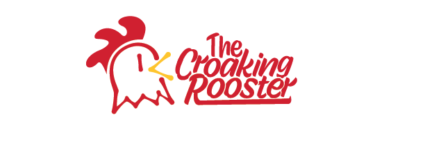
Restaurant Logo
This logo was designed for a breakfast diner called The Croaking Rooster. I chose colors that evoke the vibrant hues of a rooster and selected a typeface that complements the rustic, country theme. To add visual interest, I carefully arranged the letters, overlapping them strategically. Additionally, I extended the tail of the 'R' to create a sense of flow and harmony throughout the logo. This design was created in Adobe Illustrator.
Farmer’s Market Poster

This poster for the Charleston Farmer’s Market features custom-designed icons, carefully arranged to create a sense of unity and balance through their shapes and colors. I selected typefaces that capture the essence of Charleston's unique character, while paying close attention to visual hierarchy to ensure the content flows seamlessly. The entire design was crafted in Adobe Illustrator.
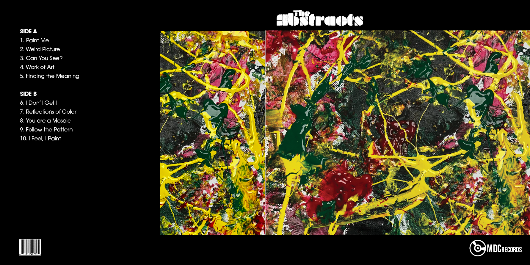
Album Cover
This album cover was designed for a fictional band I created called The Abstracts. To stay true to the theme, I used one of my own abstract paintings for both the cover and part of the back. The song titles were also inspired by abstract concepts, reinforcing the overall theme. The logo design was created in Adobe Illustrator, while the layout and remaining elements were crafted in Adobe InDesign.
Back
front
Women Sports Magazine

Cover

Page 2

Page 6
Page 3

Page 4

Page 8
Page 10

Back
Page 5
Page 7
Page 9

Page 11
This 12-page magazine highlights women in sports, with a design that emphasizes strength through the use of bold typefaces. To maintain visual harmony, I color-picked from the images throughout the magazine, ensuring a cohesive and aesthetically pleasing layout. All images are stock photos, with some edited in Adobe Photoshop. The magazine's layout was designed using Adobe InDesign.